PawsitivelyFresh

PawsitivelyFresh is a pet food subscription app that caters to users who want to streamline their pet food purchases.

In addition to offering one-time purchases, this app also provides a convenient subscription-based delivery service. Users can choose from fixed schedules or customize delivery according to their pet's specific needs, taking into account factors such as age, gender, breed, and health conditions.
This case study is done as part of the Google UX Design Professional Certificate.

My Role: UX designer and UX researcher

Project timeline: February-May 2023

Tools: Figma, Miro, Google Sheets

Responsibilities:

Conducting interviews, making empathy maps, and performing competitive audit

Creating paper and digital wireframes, low and high-fidelity prototypes

Conducting usability studies

Problem

Forgetfulness

Working pet owners often face the issue of occasionally forgetting to purchase pet food on time, which can disrupt their pets' regular feeding schedule, causing gastrointestinal upset.

Many pet owners struggle with the challenge of not knowing the right daily food for their pets, considering their specific dietary requirements, causing obesity or malnutrition.

Feeding amount

Users

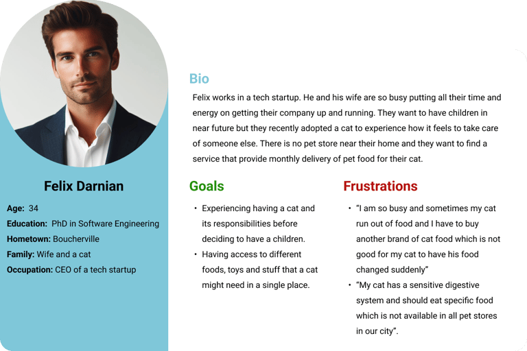
Problem statement: Felix is a busy person who needs an app that automatically delivers pet food to his home because sometimes he forgets to buy food for his food-sensitive cat.

Persona

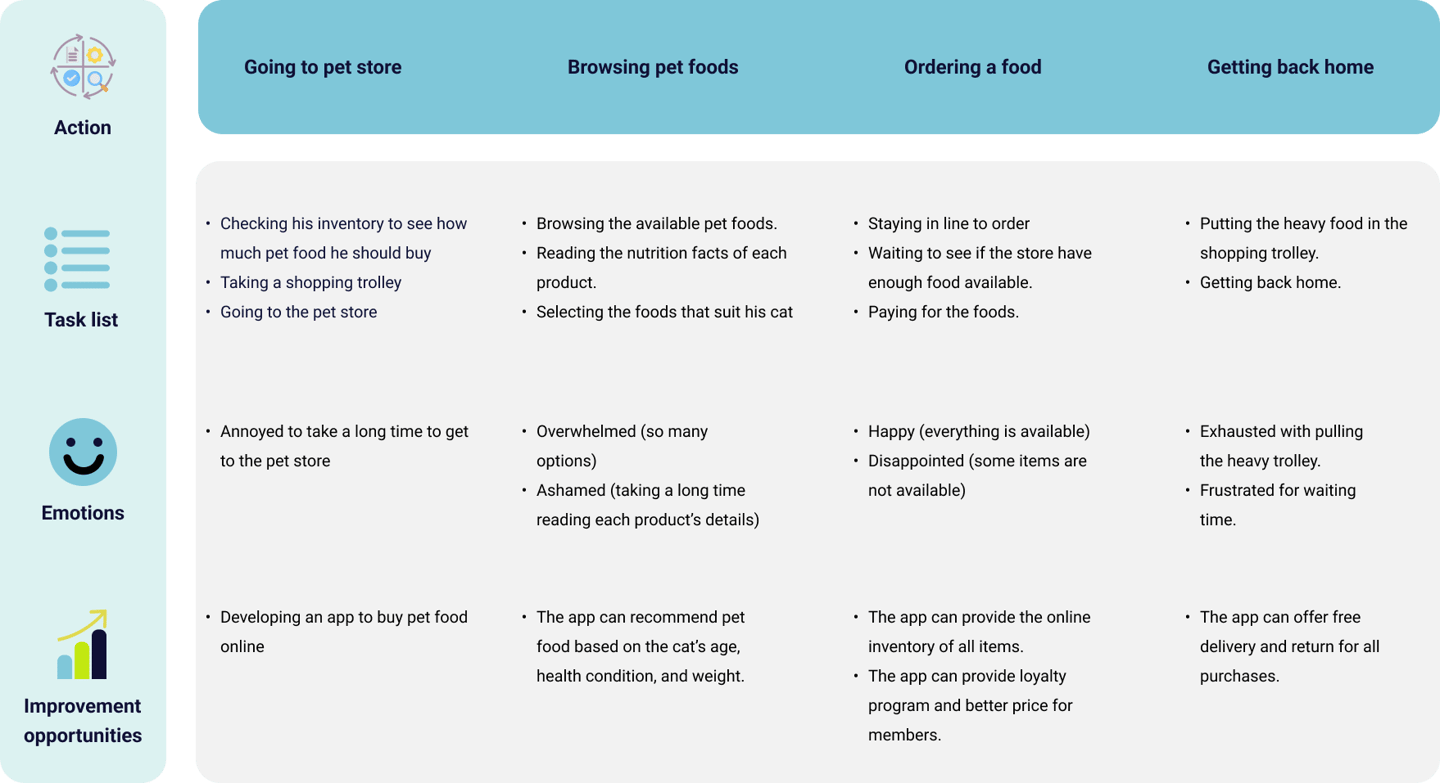
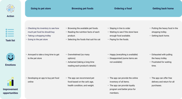
User journey map

Design

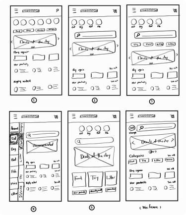
By undergoing multiple ideas, the paper wireframes were carefully refined to align with users’ needs and meet their expectations by following similar elements and design patterns of other apps.

Paper wireframe

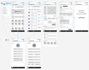
Digital Wireframes

The first iteration of the digital wireframe includes three main sections: pet food ordering, user profile, and pet information. All that is required for ordering a product, including images, user ratings, delivery methods, product details, and reviews, was presented on these pages.

The low-fidelity prototype contained seven pages, five of which showed the process of ordering a pet food using the app. The other two pages depicts pet and user profile pages.

Low-fidelity prototype

Usability studies and iterations

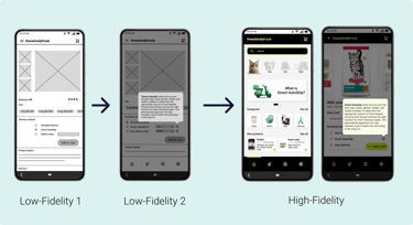
I conducted two rounds of usability studies. Findings of the first study on the low-fidelity prototype revealed that users need more clarifications regarding the concept of subscription-based pet food app. Moreover, they needed better navigation options. The second round of usability study was done on a high-fidelity prototype the results of which were more concerned with better display of some elements of the app.

Usability study findings

1- More explanation

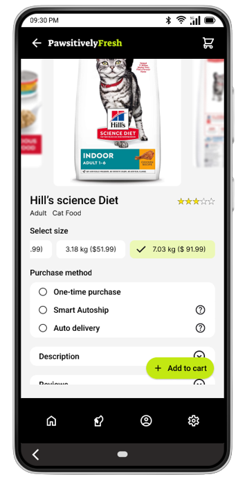
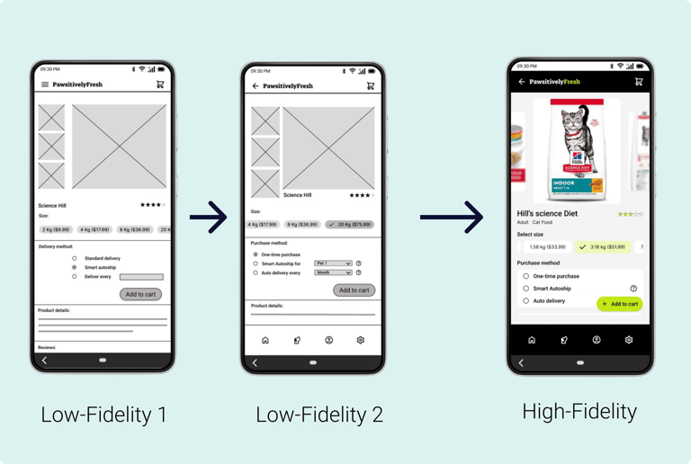
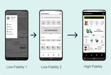
Modifications: Explanations about the Smart Autoship and Auto delivery were added to the second iteration of the lo-fi prototype and the Hi-fi prototype in the home page using a card and in the product page using a popover.

2- Clear feedback

3- Better navigation

Modifications: The selection of the items was improved by changing the color of the selected items and adding a checkmark.

Modifications: The navigation bar replaced the hamburger menu to provide easier access to the main pages of the app.

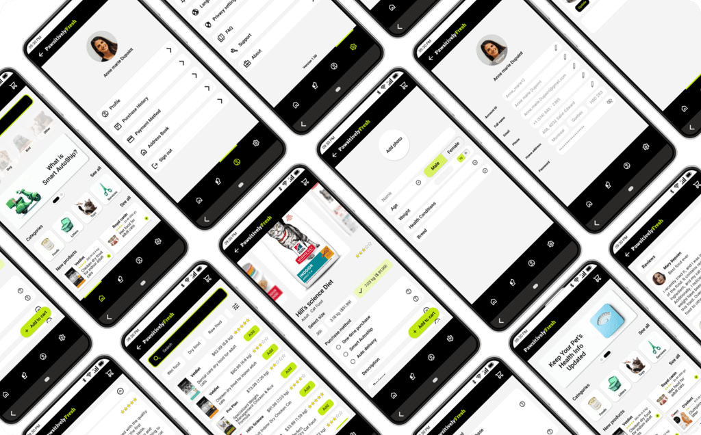
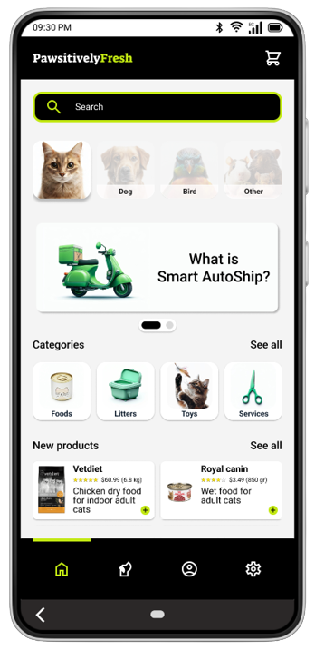
High-fidelity prototype

After two rounds of usability testings on low-fidelity and high-fidelity prototypes we made some changes to address what users found either difficult to understand or challenging to get to the final goal of purchasing a product.

Takeaways & Next steps

  • Different rounds of usability studies helped me not stick to my original design and include user feedback sooner and faster in the design process.

  • I better understood in action the importance of accessibility in the design process, including the color contrast, touch target area, alt-texts, and feedback elements.

What I learned

Next steps

  • Preparing and sharing the documentation and design guidelines with the development team and collaborating with them to implement the final product.

  • Performing user tests in the upcoming stages of product development to refine the interactions and make the necessary changes.

  • Ongoing support after the product launch.

Credit: Some of the icons on this page are downloaded from Flaticon.com