
In Progress
State
Goal
Redesign the UX/UI of educational games to improve usability & engagement.
Target Users
Graduate students in Industrial Engineering and Business
My Role
UX/UI Designer (freelance)
Activities
UX Audit, Flow Design, Design System, Prototyping
Platform
Web (Desktop + Tablet)
Tools
Figma


Industry
Higher Education / EdTech

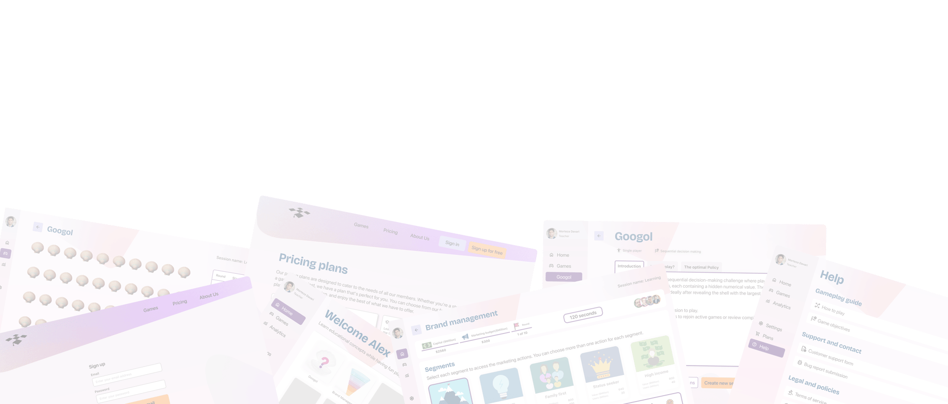
Final Design Walkthroughs
Public pages overview
Platform Overview
To help you quickly understand the final experience, I’ve included four short videos showcasing key areas of the redesigned platform:
Public Pages Overview – A look at the landing, sign-up, pricing, and about pages
Platform Overview – Navigation structure, dashboard, and user flow
Googol Game – Gameplay, flow, and interaction design
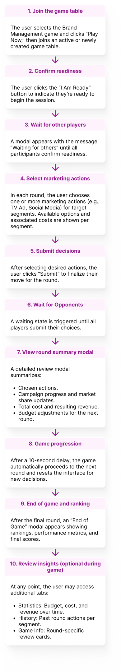
Brand Management Game – Complex interactions, feedback, and round structure
These walkthroughs provide a visual summary of the final experience. For more context—including design rationale, research insights, and UX decisions—continue exploring the sections below.
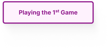
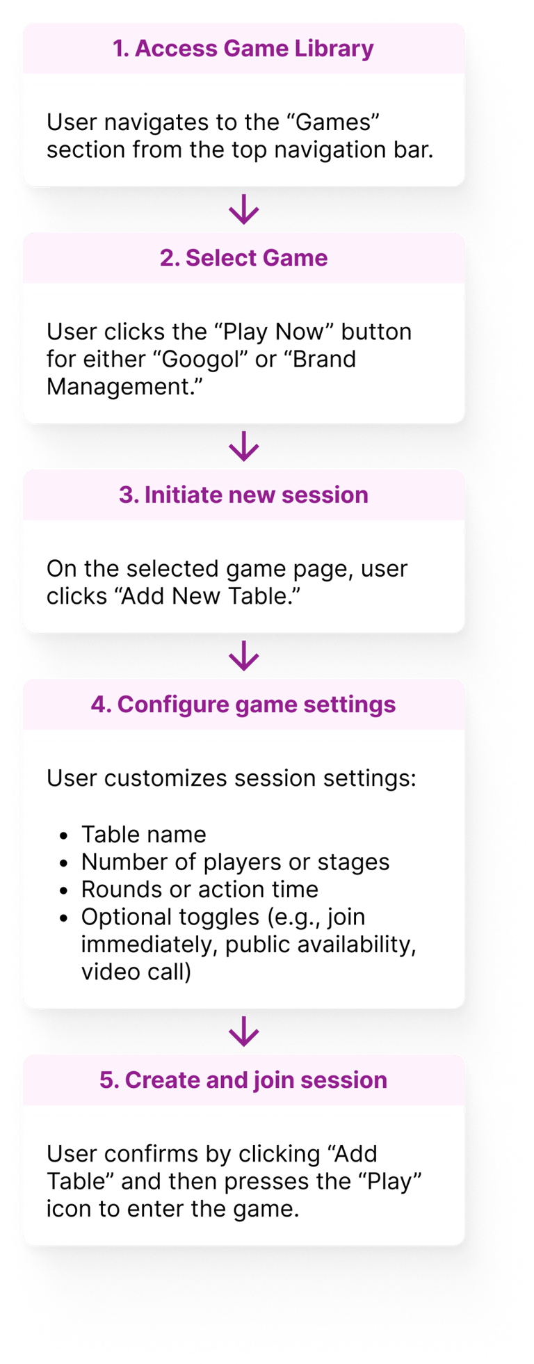
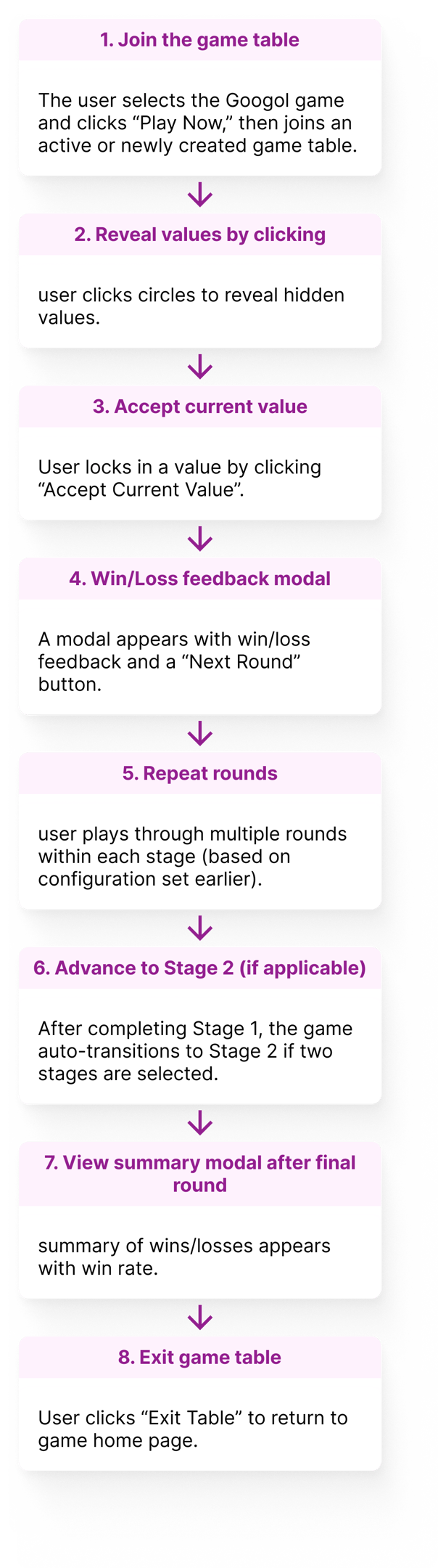
1st game (Googol)
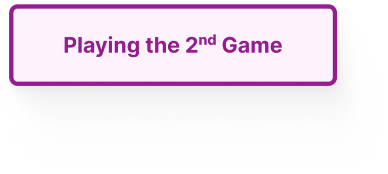
2nd game (Brand Management)
Context & Problem Space
A learning platform currently featuring two interactive web-based games designed to teach operations research and business strategy to higher education students in an engaging classroom environment.
What is the Business Education Laboratory?
The logic behind the games was academically solid, but the user experience was fragmented, visually outdated, and difficult to navigate — undermining the learning experience and limiting the platform’s potential for broader use and monetization.
I was brought in to redesign the experience from the ground up, with a focus on visual clarity, intuitive navigation, improved user engagement, and a scalable design system to support future growth.
What is the problem space?

Visual Clarity

Intuitive Navigation


User Engagement
Research & Discovery
Since I couldn’t test directly with students, I partnered with the platform’s creator to play through the games and identify pain points from both educator and user perspectives. I used the following methods:
Heuristic evaluation of the original UI
Cognitive walkthroughs of key flows (sign-up, setup, gameplay)
Task flow analysis to clarify user goals
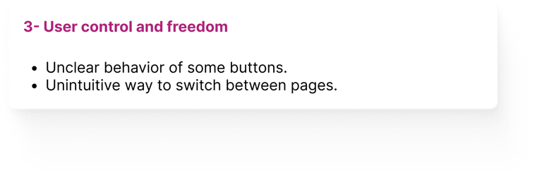
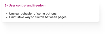
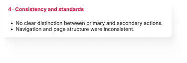
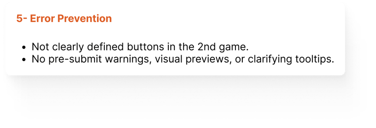
The results of the previously mentioned methods revealed the following key issues:
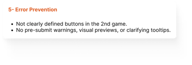
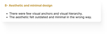
Unclear Objectives and Rules – Game goals and stage distinctions required verbal explanation from instructors.
Inconsistent and Unclear CTAs – Buttons like “Submit” and “I Am Ready” varied in style and placement, leading to confusion.
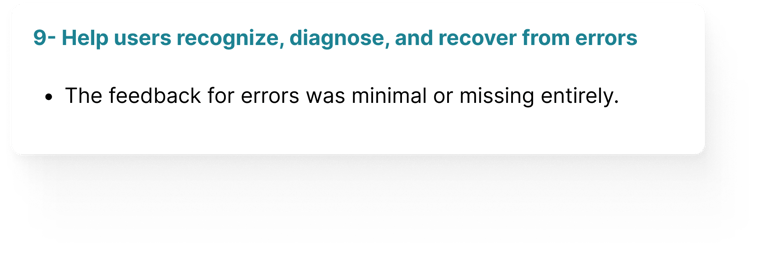
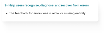
Lack of Feedback and Engagement Cues – The visual design offered minimal feedback or emotional engagement during gameplay.
Scattered and Ambiguous Information – Game state, progress, and labels were disorganized or misleading.
Insufficient Accessibility Considerations – Font size, contrast, and focus indicators did not meet accessibility standards.
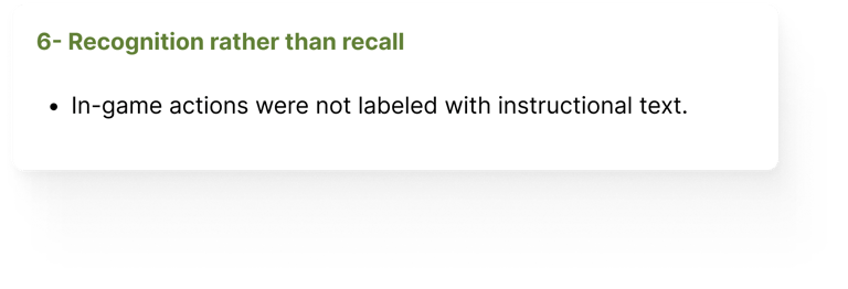
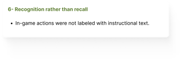
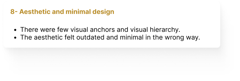
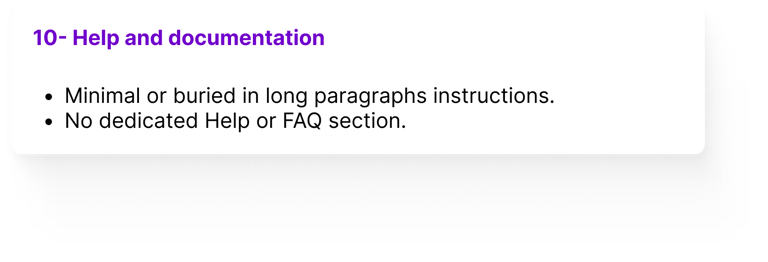
The heuristic evaluation and cognitive walkthrough revealed that the initial design exhibited at least one usability issue for each of Nielsen’s 10 heuristics, underscoring the need for a comprehensive redesign to enhance clarity, control, consistency, and overall user support.
I mapped four core task flows to gain a clear overview of how users navigate the platform and where friction points emerged. The task flow analysis uncovered key usability gaps—such as unclear progress indicators, vague feedback, and missed instructional cues—that disrupted the player experience.
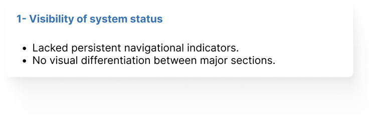
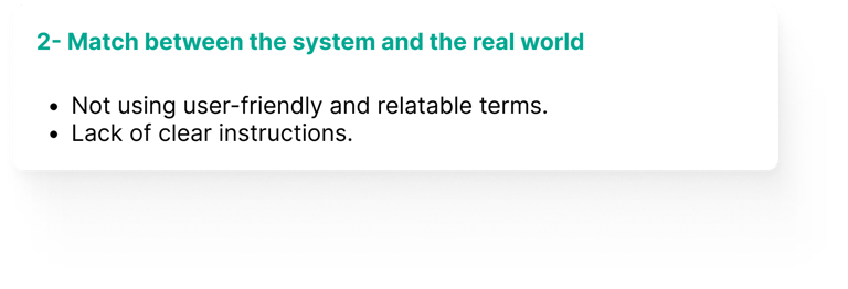


1- Heuristic Evaluation & Cognitive Walk Through
2- Task Flow Analysis


Main Findings:
To address these, I proposed targeted UX improvements—such as clearer progress indicators, intuitive terminology, visual feedback, simplified layouts, and just-in-time guidance—that enhanced clarity, reduced user effort, and increased engagement across the gameplay experience.
Design Process & Decisions
After identifying usability gaps through heuristic evaluation and task flow analysis, I redesigned the user experience to make gameplay more intuitive, engaging, and scalable for academic use. Below, you’ll find the initial design before my involvement, the first iteration of my redesign (in blue), and the final version (in purple). My process followed an iterative, research-informed approach—starting in Figma with a clean yet familiar structure that prioritized clarity, usability, and future growth.
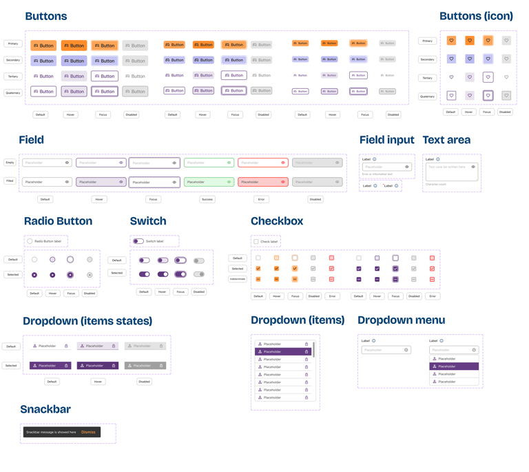
Built a scalable design system to future-proof the platform and streamline collaboration with both developers and future designers. It ensured visual and functional consistency while supporting the efficient addition of new features and games.
Tokens & Variables: Established foundational values for color, spacing, and typography to simplify global updates and improve maintainability.
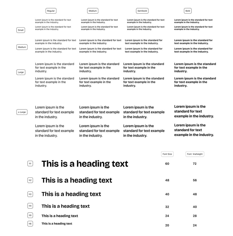
Typography & Spacing System: Defined a clear visual hierarchy to improve readability and ensure accessible, responsive layouts.
Reusable Component Library: Created flexible components for cards, buttons, forms, and dialogs—reducing redundancy and speeding up design and development cycles.
Developer Handoff Optimization: Used Figma’s variable collections and documentation to make developer collaboration smoother and more efficient.
Split the platform into public and logged-in views because public pages (e.g., About, Pricing, FAQs) can serve marketing goals, while logged-in pages evolve as the game or platform grows in features.


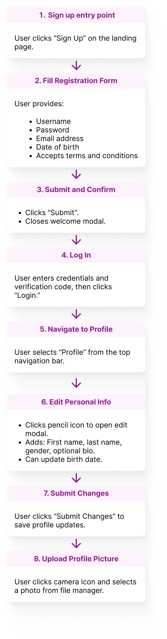
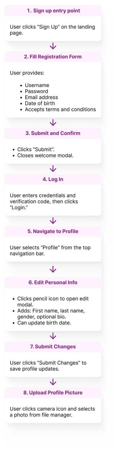
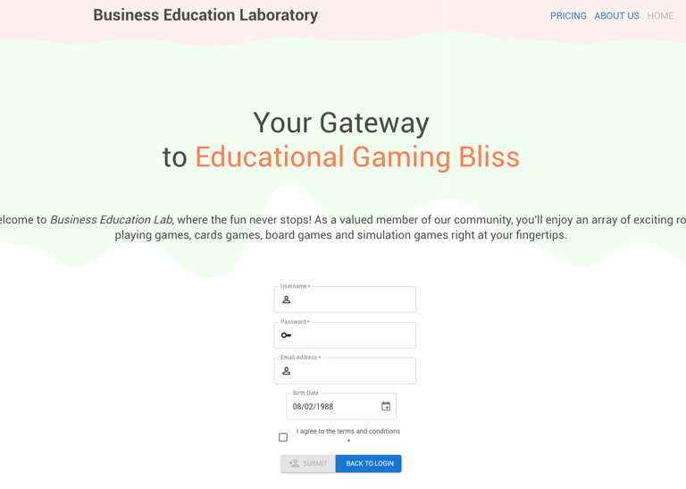
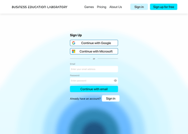
Simplified onboarding using more sign-in options (e.g., Google, Microsoft), clearer feedback, and progressive disclosure to ensure smoother user entry and profile completion—removing redundant steps from the original task flow.
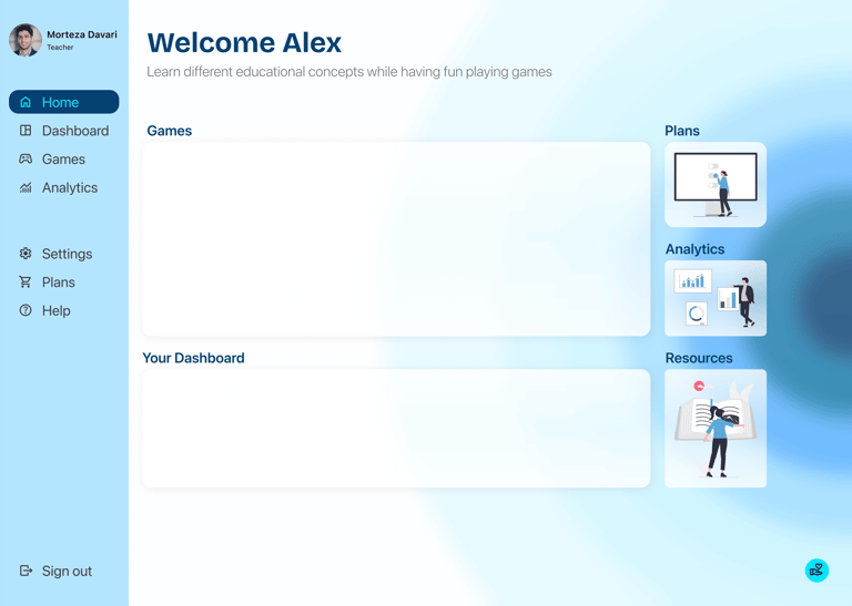
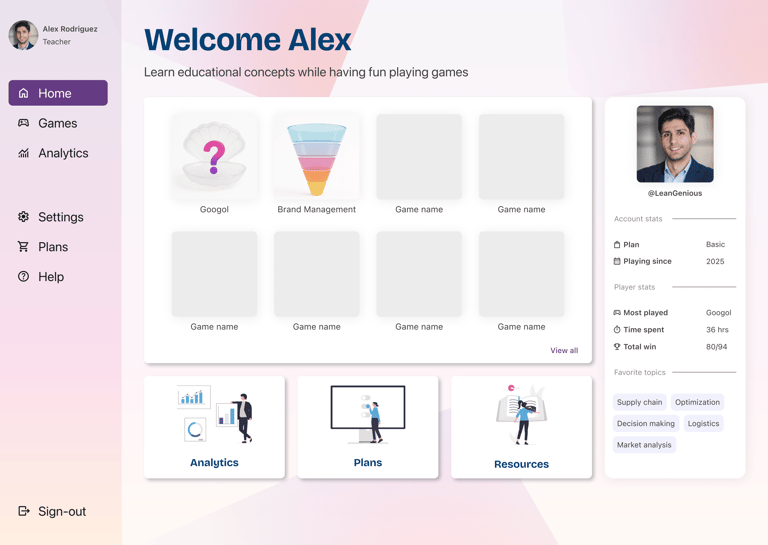
Created a dashboard for each user that gives them a central hub to manage their games, track learning progress, and access key resources and analytics. This not only reduced navigation friction and supported deeper engagement but also ensured scalability as the platform evolves with more games and features.
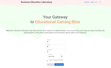

Initial Design
1st iteration of the redesign
Initial Design
1st iteration of the redesign
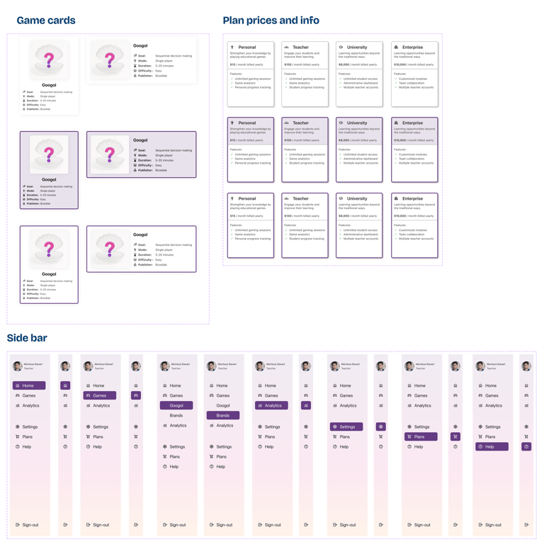
Redesigned both games to emphasize goals, instructions, progress, and real-time outcomes—reducing confusion and empowering users to make more confident decisions throughout gameplay.


Initial design
1st iteration of the redesign
Introduced sidebar navigation and structured layout grids to provide users with a clear sense of orientation, reduce cognitive load, and ensure design consistency across pages.
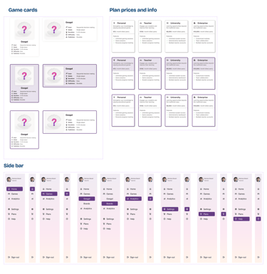
Design System

Iteration & Feedback
Throughout the design process, I regularly shared updates and prototypes with the project lead and received indirect feedback from other educators involved. Based on these sessions, I made key adjustments to:
Improve visual hierarchy.
Add clearer instructional elements.
The original blue palette was replaced with warm tones (purple, orange, soft pink) to create a more inviting, playful, and educational feel—moving away from a cold, corporate look.
I also asked a fellow UX designer to review the design — and their feedback confirmed that the revised platform felt more intuitive, organized, and classroom-ready.
Final Design

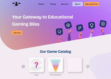
Landing page
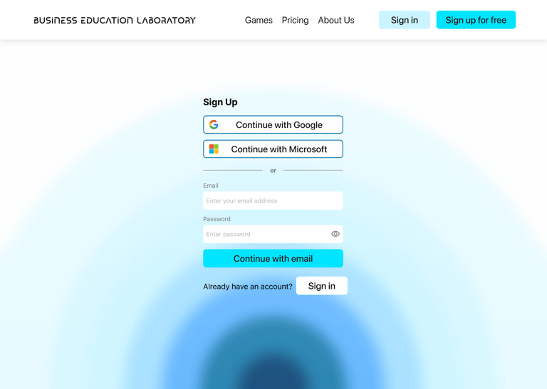
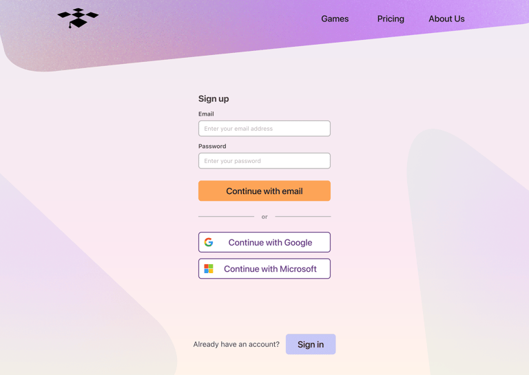
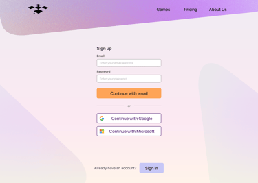
Sign-up page
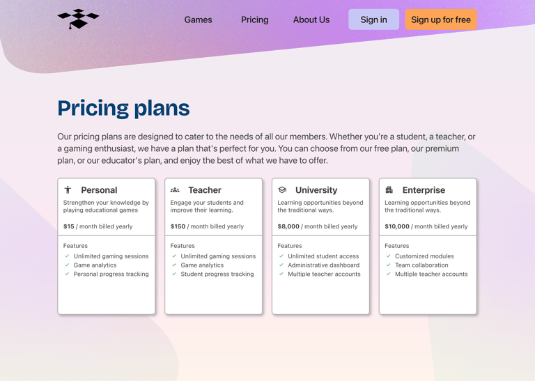

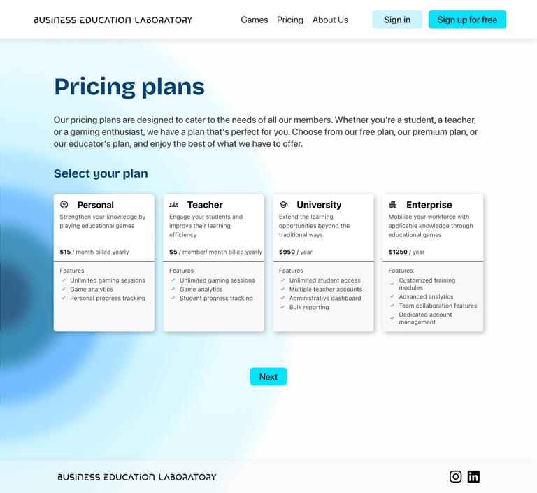
Pricing plans page
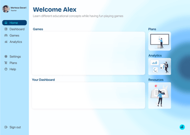
Home page
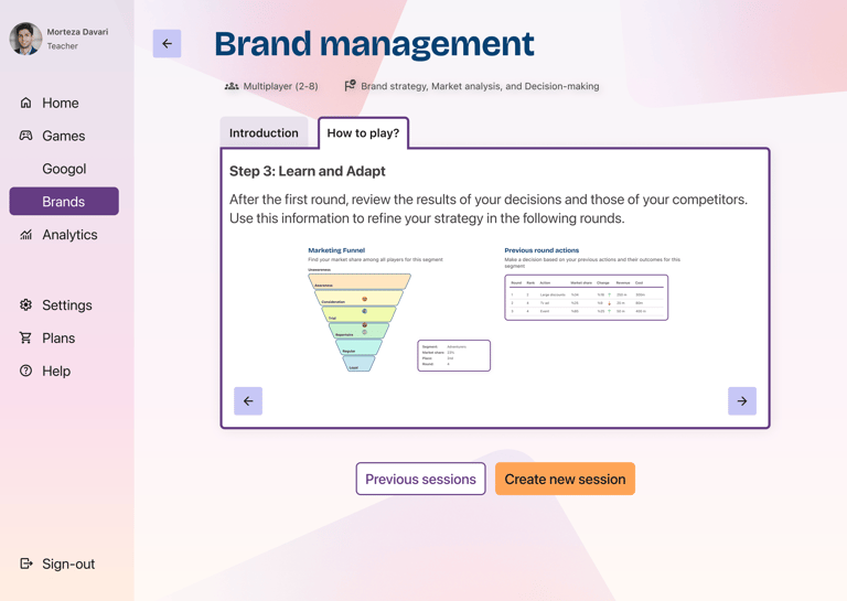


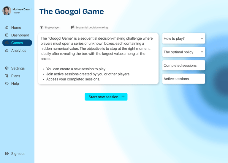
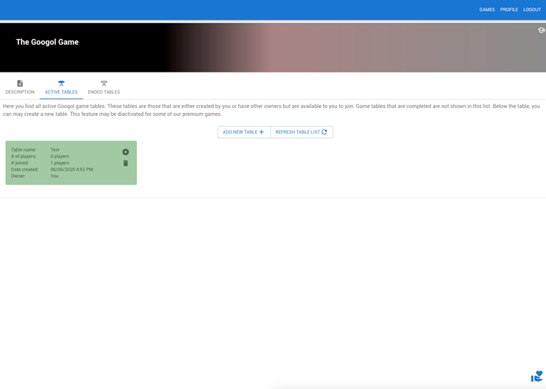
2nd game home page (game rules)
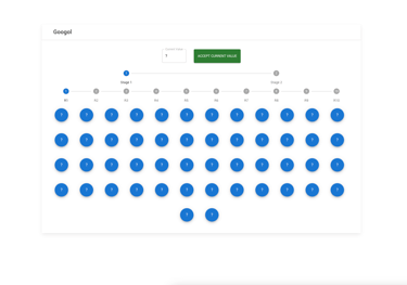
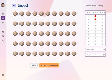
1st game play page (real-world mapping)
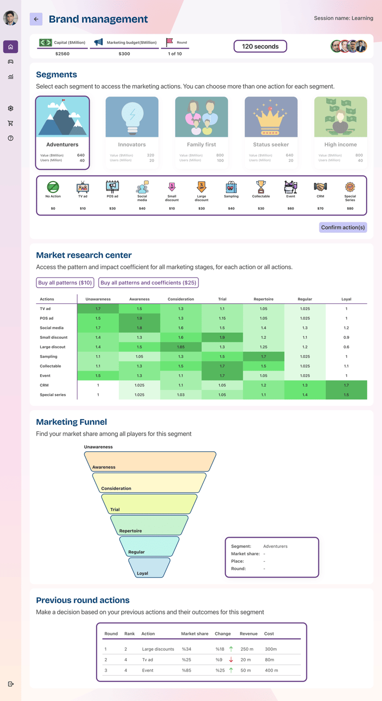
2nd game page (Progressive disclosure)
Public pages—including the landing, sign-up/sign-in, games overview, pricing, and About Us—were redesigned to feel more vibrant, inviting, and intuitive. A warmer color palette and playful visual elements helped create a more engaging first impression and guided users toward deeper exploration of the platform.
Reorganized the sign-up/sign-in pages to reduce visual clutter and simplify the user journey.
Applied clear hierarchy with primary and secondary buttons to guide actions.
Introduced progressive disclosure during sign-up to streamline the process and eliminate four extra steps identified in task flow analysis.
Added login access from secondary pages (e.g., About Us, Pricing) for greater flexibility.
Proposed alternative login options such as Google and Apple to improve accessibility and user convenience.
Public Pages
Logged-in views
Once signed in, users needed a clear structure to manage their learning journey and move seamlessly between games. This was achieved by introducing a centralized dashboard for each user and a persistent sidebar for simplified navigation. Key improvements included:
Improved Terminology: Refined in-game language for better clarity and user understanding.
Rule Previews: Added visual previews of game rules to reduce confusion and support quick onboarding.
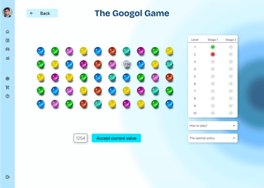
Real-World Mapping: Redesigned the first game’s UI from generic number circles to scallop shells—aligning the visual metaphor with the gameplay goal of “finding the highest number”.
Reduced Cognitive Load: Structured the second game’s dense information into clearly defined sections using progressive disclosure, making it easier to digest and minimizing user error.
Outcomes & Learnings
Although the new version has not yet launched in classrooms, the redesign has already made a meaningful impact:
This project reinforced how much value a clear design system and scalable structure bring — not just for UX quality, but also for team momentum and developer alignment.

Educators felt the redesign was significantly clearer, more engaging, and more “professional”.
Stakeholder Feedback
Team Confidence
Boosted confidence in the platform’s potential to generate revenue through academic subscriptions and future B2B sales to universities and companies.
Peer Validation
UX peer review validated improvements in visual clarity, interaction design, and overall task flow efficiency.

Personal Growth
Strengthened my skills in building scalable design systems, applying tokenization best practices, and preparing dev-friendly handoffs for smoother implementation.